From minimal dark gradients to neon cyberpunk — practical ideas that actually look good on a small screen.
Why Watch Wallpapers Are a Different Beast
Phone wallpapers are easy. You crop, you set, you move on. Watch wallpapers? That’s a whole different problem. The screen is tiny. The ratio is square or circular. And complications — your battery, heart rate, date — they sit right in the middle of your image. I’ve lost count of how many times I found a beautiful photo, only to have the time overlap a face or a mountain peak. This list fixes that. Every idea here is picked for how it actually looks on a wrist, not just on a phone screen.
Here are 30 wallpaper ideas organized by style. No downloads, just inspiration. Use them as a starting point for your own search or creation.
Minimal & Clean
These are for people who want the watch to feel like a tool, not a distraction. Less noise, more function.


1. Solid dark gradients. A slow fade from black to dark navy. Complications pop against the gradient because there’s no competing texture. Perfect for always-on display mode — barely any power drain.
2. Monochrome textures. Think concrete or fine sand in gray tones. The grain is subtle enough that your eyes ignore it, but it adds depth. Your watch looks like a piece of industrial design.
3. Single-color with subtle grain. A flat beige or light gray with tiny noise added. It mimics old paper or matte plastic. The time becomes the main event. No fighting for attention.
4. Matte black. True black background with zero detail. Chances are your Watch has an OLED screen. Black pixels are off pixels. This saves battery and makes white complications look like they’re floating.
5. Soft beige. A warm, sand-like tone with a faint vignette darker at the edges. It works well with gold or silver watch cases. Keeps the face calm even in bright sun.
Dark & Moody
Dark wallpapers are the most practical for watches. They hide bezels, save battery, and look serious. But plain black gets boring fast.


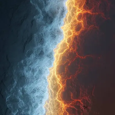
6. Deep black with faint glow. A near-black background with a soft amber or blue glow coming from the bottom edge. It feels like a distant city at night. Complications sit in the dark area, readable but not harsh.
7. Charcoal textures. Close-up photos of burnt wood or crushed graphite. The uneven darkness tricks your eye into seeing more depth than there is. Great for matching with dark leather bands.
8. Dark ocean. A shot of deep water with just a hint of light filtering from above. The blue-black tones are calming. Your heart rate complication looks like a sonar reading.
9. Night sky without stars. No constellations, no Milky Way. Just a deep, dusty darkness that could be space or a cave. It makes the watch face feel infinite. Complications look like distant spacecraft.
10. Dark marble. Black stone with thin white veins running through. The veins add movement without clutter. Each watch face becomes unique because the pattern never repeats the same way.
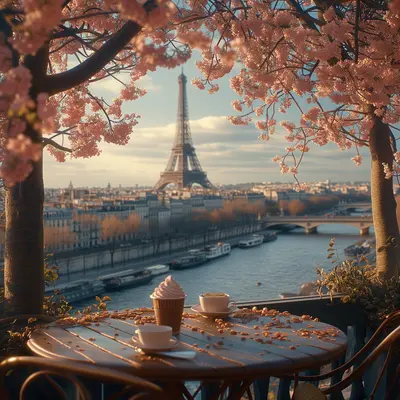
Nature & Earth
Nature wallpapers on a watch are tricky. Too much green or blue and complications disappear. These ideas keep the subject centered and the edges simple.

11. Mountain silhouette at golden hour. A dark mountain shape against a warm orange sky. The silhouette is solid, so complications placed in the sky area stay readable. The contrast is dramatic but not busy.
12. Underwater macro. A close-up of a coral or sea anemone. The detail is in the center, with blurred blue edges. Your watch feels like a porthole into a reef. Works best with dark complications on the edges.
13. Forest canopy from below. Looking straight up at tree branches against a bright sky. The dark branches frame the edges naturally. The center is open sky — ideal for placing the time.
14. Desert dunes. Smooth sand curves with sharp shadows. The lines are simple and directional. They guide your eye toward the center of the screen where the watch face lives.
15. Rain on glass. A shot of water droplets on a window, with a blurred city or forest behind. The droplets add texture but the blur keeps it from being distracting. Very calming on the wrist.
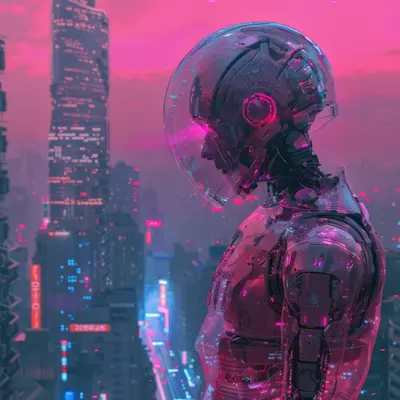
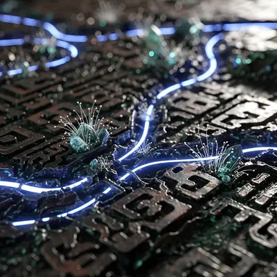
Cyberpunk & Neon
These are for when you want your watch to look like it belongs in a sci-fi movie. They work best on larger watch faces like the Ultra.


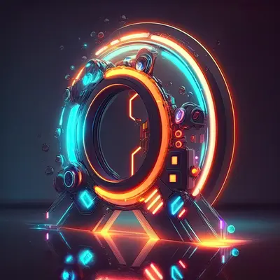
16. Neon grid. A dark background with thin glowing lines forming a perspective grid. The lines pull your eye to the center. Complications can sit inside the grid squares like data readouts.
17. Glitch art. RGB color separations and horizontal scan lines. The distortion is intentional, so it hides the fact that complications might cover parts. Looks like your watch is part of a larger system.
18. Holographic foil. A rainbow shimmer effect that shifts color depending on the angle. On a watch screen, it looks like a futuristic ID badge. Keep the complications small — let the foil be the show.
19. Circuit board macro. Extreme close-up of a motherboard with gold traces and tiny components. The detail feels technical and expensive. Your watch looks like a diagnostic tool.
20. Neon sign reflection in wet street. Blurred pink and blue lights on a dark wet road. The reflection creates a mirror effect. The dark top half is perfect for your time and date.
Luxury & Premium
Think expensive materials. These wallpapers make your Watch look like a high-end timepiece, not a gadget.


21. Brushed titanium texture. Close-up of machined metal with fine parallel scratches. The metallic sheen catches light differently on screen. Matches perfectly with titanium watch cases.
22. Black and gold geometric. Sharp triangles and hexagons in dark tones with thin gold lines. The geometry feels architectural. Gold accents complement yellow gold or rose gold bands.
23. Carbon fiber closeup. The woven pattern is repetitive but complex. It adds a racing or aviation feel. The dark base means complications stay visible. Great for sporty but premium looks.
24. Marble with gold veins. White or gray marble with thin metallic gold cracks running through. It’s elegant without being flashy. The organic veins keep it from looking like a texture map.
25. Leather grain. Macro shot of genuine leather with visible pores and texture. The warm brown tones add a vintage feel. Your digital watch suddenly looks analog.
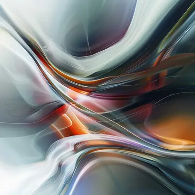
Abstract & Artistic
These are for people who want their watch to be a conversation starter. Abstract works because there’s no recognizable subject to compete with your complications.
26. Fluid ink in water. Black and colored ink swirling in clear liquid. The organic shapes are unpredictable. Each look gives you a different pattern. The dark background keeps it from being too chaotic.
27. Color smoke. Thick colored smoke against a dark backdrop. The soft edges mean there’s no harsh line to conflict with the watch interface. It’s like wearing a tiny painting.
28. Geometric origami. Folded paper shapes with sharp creases and shadows. The angular forms create natural zones. You can mentally place complications on the flat paper triangles.
29. Oil paint strokes. Thick impasto strokes of paint, photographed in macro. The texture is visible but abstract. It adds a tactile quality to a glass screen.
30. Generative art patterns. Algorithm-generated shapes like fractals or cellular automata. The patterns are mathematical but organic. No two generations are the same. Your watch is literally unique.
How to Pick the Right Wallpaper for Your Watch
I’ve made a lot of mistakes here. Here’s what I learned.
Consider your complications first. If you use four complications, don’t pick a wallpaper with important details in the corners. Dark edges and bright centers work best. If you use minimal complications, you can go wilder.
Avoid busy patterns. Herringbone, dense florals, or repetitive geometrics. They make the screen look cluttered. The time gets lost. Simple textures or gradients are safer.
Match your band. A leather band with a marble texture? Weird. A metal band with a brushed metal wallpaper? Perfect. Think of the wallpaper as an extension of the band material.
Test with always-on display. Some wallpapers look great when the screen is active but turn into a dim mess in always-on mode. Dark wallpapers with simple shapes fare better. Check both states before you commit.
Where to Get These Wallpapers
You have options. I’ve tried most of them.
WatchWalls AI is the easiest route. It generates wallpapers at the exact resolution for your Apple Watch. No cropping, no stretching, no guesswork. The app has styles for every category above. You can describe what you want and it builds it in seconds. Download it from the App Store here. It’s built specifically for watch screens, so you skip the headache of manual resizing.
Pinterest is great for inspiration. Search “apple watch wallpaper ideas” and you’ll find boards full of them. Just be careful about resolution. Many images look fine on phone but pixelate on watch.
Unsplash has high-res photos you can crop yourself. Search for textures, not scenerys. A macro shot of wood grain or fabric works better than a wide mountain scene.
Manual photo editing works if you have the patience. Use a photo app to crop your image to 384×384 or 410×502 pixels depending on your Watch model. Keep the subject centered and the edges dark. Test it before you set it.
Frequently Asked Questions
Tap any question to see the answer
What resolution should an Apple Watch wallpaper be?
It depends on your model. The Apple Watch Series 9 and Ultra 2 use 384×384 pixels for square faces. The Ultra also supports 410×502 for the larger display. Always check your specific watch model before cropping. A wallpaper that’s too small will look blurry.
Can I use a photo from my camera roll as a watch wallpaper?
Yes. Open the Photos app on your Watch, find the image, and tap the share button. Choose “Create Watch Face.” The Watch will crop it automatically, but the results vary. Portraits and close-ups work better than wide scenerys.
Do dark wallpapers really save battery on Apple Watch?
Yes, but only on models with OLED screens. That includes Series 4 and newer. Black pixels are turned off, so they use no power. The more black in your wallpaper, the longer your battery lasts. Dark gradients also help because they keep the screen mostly off.
How do I keep my complications readable over a busy wallpaper?
Use a complication with a colored background or a shadow. In the Watch app on your iPhone, you can enable “Monochrome” complications that use a single color. Or pick a wallpaper where the busy area is away from your complication positions.
Are watch wallpapers from third-party apps safe to use?
Most are safe. Stick to apps from reputable developers with good reviews. Avoid apps that ask for unnecessary permissions like location or contacts. WatchWalls AI, for example, only needs access to save the wallpaper to your photo library.
Want to try these ideas on your watch?
WatchWalls AI generates wallpapers at the exact resolution your Apple Watch needs. Pick a style, get a wallpaper in seconds.
Download Free on App Store