Best Pastel Wallpapers for Apple Watch: Soft & Dreamy Designs
Why Pastel Wallpapers Work on Apple Watch
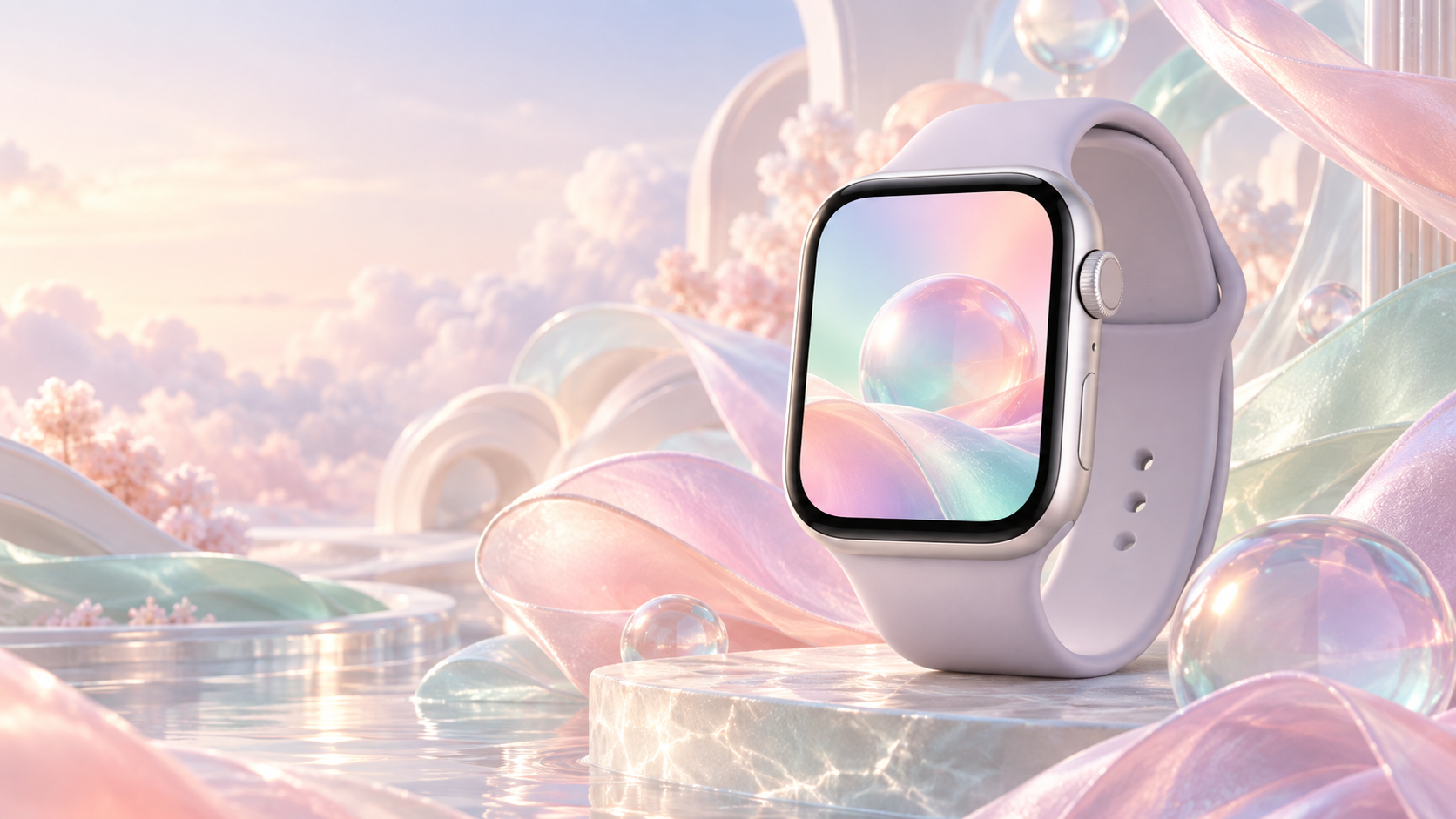
The pastel wallpaper trend on Apple Watch is a direct counterpoint to the dark OLED aesthetic that dominated watch faces from 2020 to 2023. Where dark backgrounds reduce pixel brightness to save battery and boost contrast for white text, pastel tones take a different path: they use low-saturation color to create a soft, airy background that still keeps time-readout text sharp enough to read at a glance.
There are four reasons pastel designs keep growing in popularity among Apple Watch owners:
- Soft contrast without eye strain. A muted blush or lavender base sits comfortably under white or dark-grey complications. It is easier on the eye in bright outdoor light than a pitch-black background that makes the whole display look like a void.
- Feminine aesthetic with broad appeal. Pastel colors carry a deliberately soft, styled look that pairs naturally with fashion-forward bands. They photograph well on social media, which matters to a growing segment of Apple Watch buyers who treat the watch as a wearable accessory first and a fitness tool second.
- Spring and summer moods. Seasonal styling is real. Switching to a mint-green or peach-sunset wallpaper in April costs nothing and refreshes the way the device feels on your wrist. The same principle that drives phone wallpaper changes applies to the watch.
- Calming psychological effect. Color psychology research consistently places soft, cool-toned pastels in the “low arousal, positive valence” zone — meaning they feel calm without feeling dull. For a device you glance at dozens of times a day, that matters more than you might expect.
For a broader look at background styles that combine mood and aesthetics, see the full guide to aesthetic Apple Watch wallpaper options.
12 Pastel Styles to Try Right Now
Each entry below describes the visual style, the dominant hex range, and the watch-face type it pairs with best. All examples are available in square-crop format at 484×484 px for the standard watch face canvas.
1. Blush Pink Cloud
Soft off-white base with diffuse pink wisps that drift across the center. Hex range: #FADADD to #FFF0F0. Pairs well with the Portraits face and any analog hand style. The cloudy texture adds depth without distracting the eye away from complications.
2. Lavender Gradient
A smooth vertical fade from pale lilac (#E6E0F8) at the top to near-white (#F8F5FF) at the bottom. Gradients are one of the most popular Apple Watch background styles — for more gradient options beyond pastels, see the Apple Watch gradient wallpaper collection.
3. Mint Green Minimal
Flat mint (#C8F0E0) with a single thin horizontal line at the golden-ratio point. Minimal designs reduce cognitive load, making complications pop against a clean background. Works best with the Modular or Infograph Modular face.
4. Peach Sunset
Horizontal bands of soft peach (#FDDCB5), warm apricot (#FBBF8A), and pale gold (#FDF0D5) that mimic a watercolor sunset. The warmth reads as energetic without crossing into saturated territory.
5. Baby Blue Sky
A still, cloudless sky in #BEE3F8. No gradient, no texture — pure flat color. Deceptively simple, it reads as polished and modern against silver or starlight aluminum cases.
6. Soft Coral
A mid-tone coral (#F4A89A) softened toward pink. Coral is one of those colors that skirts the boundary between warm and neutral, which makes it easier to pair with more band colors than a pure red or orange ever could.
7. Lilac Floral
Small, low-saturation flower outlines on a pale lilac (#EDE0F5) ground. The pattern scale matters: at watch-face sizes, the motif reads as gentle texture rather than a busy print, as long as individual flowers stay under 30 px across.
8. Butter Yellow
Pale, creamy yellow (#FFF8DC) that catches the feel of morning light. It is one of the rarest pastel picks on Apple Watch precisely because yellow is tricky to lighten without going green, yet when it works it is immediately distinctive.
9. Pastel Rainbow
Thin diagonal bands of blush, lavender, mint, peach, and baby blue from corner to corner. The key is keeping each band narrow (under 60 px) and fully desaturated so the whole image reads as cohesive rather than garish. For more playful background ideas, browse the cute Apple Watch wallpaper roundup.
10. Rose Quartz
Named for the Pantone color of 2016, rose quartz (#F7CAC9) is a dusty, slightly grey pink. It sits between blush and mauve, giving it a sophisticated edge that works year-round rather than feeling purely seasonal.
11. Sage Green
Muted, grey-green (#B2C2B0) that leans earthy rather than fresh. Sage reads as a neutral in the pastel family, making it one of the few backgrounds that works as well with a dark watch face font as with a light one.
12. Powder Blue Geometric
Soft isometric hexagons or low-polygon triangles in two tones of powder blue (#DCEEFB and #B3D9F2). The geometry adds visual interest while the color keeps the overall mood soft and unhurried.
Pastel vs. Dark: When to Use Each
Both palettes are valid choices — the decision comes down to context, not preference alone.
Choose pastel when: You are wearing the watch during daytime casual settings — weekend errands, a coffee meeting, outdoor walks in spring or summer. Pastel backgrounds reflect ambient light back into the display, which can make the screen feel brighter in sunny conditions without you touching the manual brightness slider. They also fit naturally in social and creative environments where the watch doubles as a style statement.
Choose dark when: You are in a dimly lit formal setting, using the watch for night-time fitness tracking, or trying to stretch battery life on a long travel day. Dark or black backgrounds on OLED panels literally turn those pixels off, which is the primary reason dark themes save power. A black background at full brightness also makes colored complications (heart rate, timer rings) appear more vivid.
One practical middle ground: set a pastel background as your primary daytime face and a dark background on a secondary face. A long press on the watch face lets you swipe between saved faces in under two seconds. For a step-by-step guide on swapping backgrounds, see how to change your Apple Watch wallpaper.
Best Color Combinations
Single-tone pastel backgrounds are the easiest starting point, but two-tone combinations give a wallpaper more personality. Three pairings stand out in the pastel family:
Pink + Lavender
Blush pink (#FADADD) meeting lavender (#C3A8D1) in a diagonal or radial gradient is the most popular pastel pairing on Apple Watch. The two colors share the same cool undertone, so the transition never looks abrupt. Watch face complications in white or gold read cleanly against both.
Mint + Peach
Mint (#C8F0E0) and peach (#FDDCB5) are complementary enough in temperature to create gentle tension — cool meets warm — without clashing. A 50/50 vertical split or a soft blended center both work. This combination leans toward spring and is one of the most-pinned Apple Watch backgrounds on Pinterest.
Blue + Coral
Powder blue (#BEE3F8) paired with soft coral (#F4A89A) creates the most visually active combination in the pastel range. Use it as a sunrise-inspired gradient (blue at top, coral at bottom) or as two asymmetric blocks. Keep both tones fully desaturated — if either color goes toward its full-saturation version, the combination tips from pastel into bold.
Matching Your Band to a Pastel Background
The band you wear completes the visual loop that runs from the background image through the case to your wrist. Three Apple Sport Band colors pair especially well with pastel wallpapers:
- White / Starlight. A neutral that works with every pastel. It lets the background color do all the work and keeps the overall look clean. Best with baby blue, sage, or any single-tone flat background.
- Pink Sand. A warm off-pink that sits close to blush and rose quartz in tone. It creates a monochromatic look with pink and lavender backgrounds while adding subtle contrast to mint and sage.
- Lavender Sport Band. Apple’s own lavender band (introduced with Apple Watch Series 9) is the closest match to lavender gradient and lilac floral wallpapers. Wearing it creates a tonal outfit where the background, band, and strap feel like a curated set rather than a random combination.
Beyond color, material matters. The Solo Loop and Sport Loop in pastel shades have a softer, more textile feel that reinforces the gentle mood of a pastel background. Stainless steel Link Bracelets and Milanese Loops, by contrast, introduce a metallic formality that pulls the watch away from the casual pastel aesthetic.
Resolution & File Format Table
Apple Watch displays vary by generation. Use the table below to export your pastel wallpaper at the right size before syncing through the iPhone Watch app.
| Model | Case Size | Display Resolution | Recommended Export Size | Format |
|---|---|---|---|---|
| Series 10 / Ultra 2 | 46 mm | 416×496 px | 496×496 px square | PNG or JPEG |
| Series 10 | 42 mm | 396×484 px | 484×484 px square | PNG or JPEG |
| Series 9 / 8 / 7 | 45 mm | 396×484 px | 484×484 px square | PNG or JPEG |
| Series 9 / 8 / 7 | 41 mm | 352×430 px | 430×430 px square | PNG or JPEG |
| Series 6 / SE / 5 / 4 | 44 mm | 368×448 px | 448×448 px square | PNG or JPEG |
| Series 6 / SE / 5 / 4 | 40 mm | 324×394 px | 394×394 px square | PNG or JPEG |
Always export at the square canvas size listed above. Apple Watch crops to a circle on most faces, but the Photos face and some wallpaper-compatible faces display the full rectangle. A square source keeps your image safe for both scenarios. Save at 72 DPI — the display does not benefit from higher DPI since pixel dimensions are what the screen actually uses.
Where to Find Free Pastel Wallpapers
You do not need to create a pastel wallpaper from scratch. Several high-quality free sources cover this style well:
- Unsplash — Pastel Backgrounds. Unsplash has a large library of free high-resolution pastel photos and flat-color images under the Unsplash License, which allows personal use without attribution. Search “pastel gradient,” “blush background,” or “soft color” to narrow results.
- Pinterest — Apple Watch Pastel Wallpaper. Pinterest boards curated by Apple Watch fans are the fastest way to see what pastel backgrounds actually look like on a watch face before you download. Many pins link back to direct-download sources.
- Pexels — Pastel Background. Pexels offers free stock images and vectors under the Pexels License. Their pastel section includes both photographic textures (watercolor paper, soft fabric) and flat digital color fields, which are the most practical for Apple Watch use.
After downloading, crop to the square dimensions in the table above using any photo editor or the built-in iOS Photos crop tool. Then open the Watch app on your iPhone, go to Face Gallery, choose the Photos face, and select your image. For the full step-by-step process, the guide on Apple Watch wallpaper ideas walks through every option available in watchOS 11.
Browse the full collection of Apple Watch backgrounds — sorted by style, color, and watch face type — and find the right look for your wrist in under a minute.
Browse All Apple Watch Wallpapers
FAQ
Does a pastel wallpaper drain Apple Watch battery faster than a dark one?
On OLED Apple Watch displays (Series 4 and later), dark pixels draw less power because they are physically turned off. A pastel background keeps those pixels lit at low brightness, which does use marginally more energy than a pure-black background. In everyday use the difference is small — typically 2–5% over a full day — but if you are pushing battery limits during a long workout or travel day, switching to a dark face makes sense. During normal daily use, a pastel background will not noticeably shorten your charge cycle.
What is the best pastel wallpaper color for readability?
Mint green and baby blue consistently score highest for readability because they sit in the cool-neutral zone where neither white nor black complications disappear into the background. Butter yellow and peach are the trickiest — white text can wash out against them in direct sunlight. If you want a warm pastel without sacrificing readability, rose quartz is a safer pick than full peach because its grey undertone maintains enough contrast for white complication text.
Can I use a pastel wallpaper with the Always-On Display?
Yes. In Always-On mode (available on Series 6 and later), watchOS automatically dims the display and may desaturate or simplify the background to save power. A pastel image in Always-On mode will look slightly washed-out compared to the active state, but this is no different from what happens to dark or vibrant backgrounds. The Photos watch face supports Always-On Display as of watchOS 10, so your pastel background will show even when the wrist is lowered.
How do I set a pastel image as my Apple Watch background?
Save the image to your iPhone’s Photos app first. Then open the Watch app, tap Face Gallery, scroll to the Photos face, tap it, and choose your image from the photo picker. Tap Add and the face will sync to your Apple Watch within a few seconds over Bluetooth. You can also set it directly on the watch by pressing and holding the current watch face, swiping to the plus icon to add a new face, and choosing Photos. The full walkthrough is in the guide on how to change your Apple Watch wallpaper.
Are pastel wallpapers only for certain Apple Watch case colors?
No — pastel backgrounds work across all case finishes, though they pair differently. Against Silver or Starlight aluminum, pastel backgrounds look fresh and light. Against Space Grey or Midnight aluminum, the contrast between the dark bezel and the soft background creates a striking framed effect that many people find more interesting than either all-dark or all-light setups. Gold and Rose Gold stainless steel cases complement warm pastels (blush, peach, butter yellow) particularly well, while the natural titanium finish of Apple Watch Ultra 2 pairs best with neutral pastels like sage green and powder blue.