 WatchWalls AI
Best Watercolor Wallpapers for Apple Watch: Artistic Paint Designs
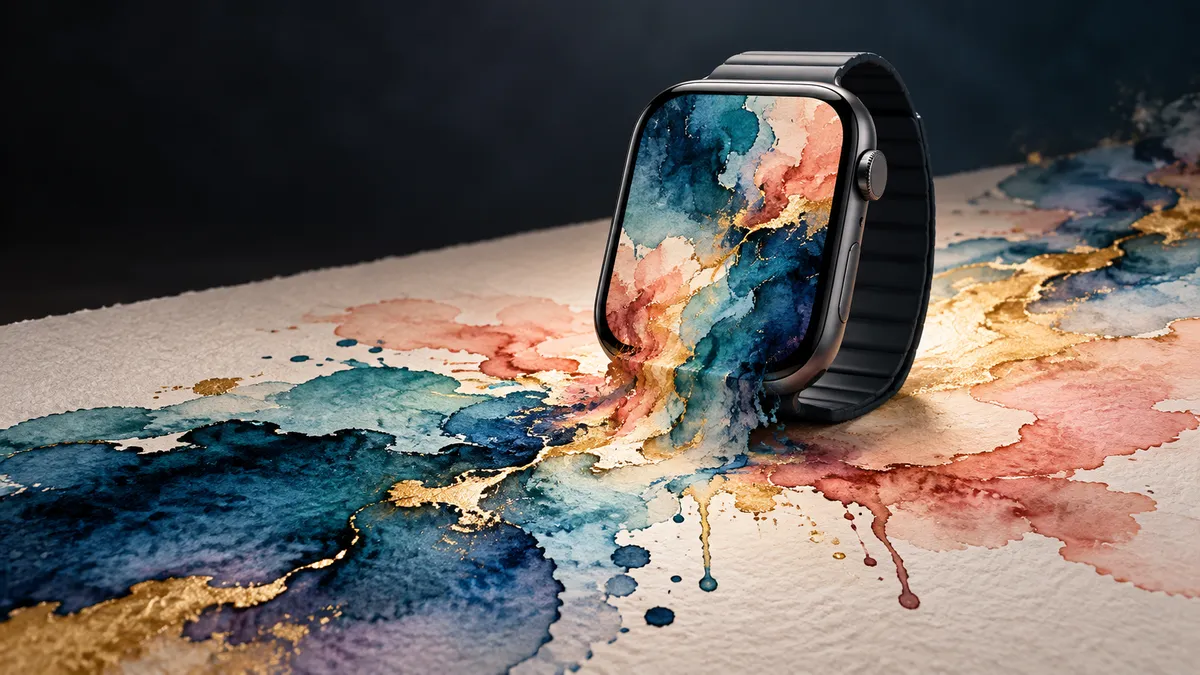
Finding the right watercolor wallpaper for your Apple Watch is about more than aesthetics — it is about choosing art that still looks intentional at the size of a postage stamp. Watercolor is one of the few art styles that actually benefits from being shrunk down: blurry edges disappear, pigment blooms stay rich, and the organic texture reads as deliberate rather than pixelated. This guide walks through 12 specific styles, the palettes that work best, and exactly how to get a watercolor image onto your wrist.
Why Watercolor Works on Small Screens
Most photographic wallpapers fall apart at watch scale. Fine detail turns into noise, sharp lines compete with watch hands and complications, and high-contrast images make text unreadable. Watercolor sidesteps all of these problems.
Soft edges play nicely with UI elements. Because watercolor bleeds at its boundaries, there are no hard lines to clash with the circular or rectangular watch face border. The image and the interface merge rather than fight.
Organic feel reads as intentional at any size. A photograph of a city that loses its buildings at 44 mm just looks blurry. A watercolor wash that loses some grain at 44 mm still looks like a watercolor wash — the information loss is part of the medium.
Every piece is unique. Unlike vector gradients or stock patterns, watercolor paintings carry physical history: brush strokes, water pooling, pigment blooms. That uniqueness transfers to the watch face and makes it feel personal rather than default.
Color stays strong. Watercolor pigments — especially in digital reproductions — carry high saturation at midtones. This means a teal-and-coral ocean watercolor still reads as teal and coral even at 44 mm, without needing the artificial HDR punch that can make other image types look garish.
If you want to explore other artistic directions, see the collection of Apple Watch abstract wallpapers for non-watercolor painterly styles.
12 Watercolor Styles to Try
1. Abstract Color Wash
A pure color wash — two or three hues bleeding into each other with no recognizable subject — is the easiest watercolor style to read at small sizes. Think indigo bleeding into warm amber across a cream background. There is nothing to lose at scale because there was never any detail to begin with. Works beautifully on both modular and infograph watch faces.
2. Floral Watercolor Bouquet
Loose roses, peonies, or wildflowers painted in wet-on-wet technique keep just enough petal shape to be recognizable while the colors do most of the visual work. Position the bouquet off-center so complications can sit in clear sky or background space. Pale backgrounds keep the time readable. For dedicated floral options, browse the full Apple Watch floral wallpapers roundup.
3. Watercolor Sunset
Horizontal bands of orange, magenta, and dusty purple mimic a sunset horizon. Because the color transitions are gradual, the image scales down without losing its mood. A thin dark strip at the bottom representing water or silhouetted hills adds depth without cluttering the face.
4. Ink and Watercolor Mix
Combining fine ink linework with watercolor fill produces images that stay recognizable at small sizes because the lines anchor the shapes. A koi fish outlined in black ink and filled with loose orange and gold wash, or a botanical sketch with muted sage fill, both hold their composition well at 44 mm.
5. Splatter and Drip Effect
Paint flicked across paper creates energetic dot patterns and flowing drips. At watch scale, splatter becomes a texture rather than a set of individual marks — which works in your favor. A white or cream base with navy and gold splatter feels both dynamic and clean.
6. Mountain Watercolor
Layered mountain silhouettes in progressively lighter values of blue, teal, or warm grey create natural depth. The atmospheric perspective built into this style means the image never looks flat, even at 44 mm. Add a hint of orange sky behind the peaks for contrast against white watch text.
7. Galaxy Watercolor
Deep navy or black backgrounds with soft blots of teal, violet, and white suggest a painted cosmos. Unlike a photograph of actual space, the watercolor galaxy stays soft — no star noise, no competing pixel clusters. Gold or white compass rose complications sit naturally on top of dark space backgrounds.
8. Botanical Leaves
Single large leaves — monstera, eucalyptus, olive branch — painted in loose greens and yellows are a reliable watch wallpaper because the subject is simple and the color palette is calming. A single leaf filling most of the frame reads clearly without distraction. Pairs well with sport and woven bands in earth tones.
9. Ocean Waves Watercolor
Rolling waves in cobalt, teal, and white foam, painted loosely rather than photographically, capture movement without sharp detail. Position the horizon line in the upper third so the lower half can hold complications. Turquoise watercolor waves also work as a companion piece to pastel designs — see Apple Watch pastel wallpapers for the lighter end of the spectrum.
10. Rainbow Blend
A full spectrum sweep — red through violet — blended in soft watercolor gradients is unexpectedly subtle compared to a hard-edged rainbow. The transitions do all the work and the result reads as celebratory without being loud. Works best with a minimal watch face that only shows the time.
11. Portrait Style Watercolor
Loose portrait paintings — a face suggested in warm ochre and rose washes, eyes hinted rather than detailed — work on larger watch faces (45 mm, 49 mm Ultra). The subject gives the image emotional weight, and the watercolor softness means the face reads as artistic rather than uncanny. Crop tight to the subject and keep the background a single faded wash.
12. Watercolor Texture (Paper Grain)
A scan of watercolor paper with light washes applied — no subject, just texture, grain, and color staining — is one of the most underrated watch wallpapers. It looks hand-crafted and personal, works behind any watch face configuration, and never competes with complications. Warm ivory with soft umber staining is a timeless combination.
Color Palettes That Pop
The palette you choose matters as much as the style. Here are four proven combinations and the contexts they suit best.
Warm Earth Tones
Burnt sienna, terracotta, warm cream, and dusty rose. This palette works with brown, tan, and red watch bands and feels grounded and autumnal. Botanical leaf and abstract wash styles carry earth tones particularly well. Text in white or pale gold reads cleanly over these mid-saturation backgrounds.
Cool Blues and Teals
Navy, cerulean, teal, and white. The most versatile watercolor palette for watches because blue reads well against both white and dark text, pairs with every standard band color, and works in both casual and professional settings. Ocean wave and mountain styles are natural homes for this palette.
Spring Florals
Lavender, soft pink, mint green, and pale yellow. Light, feminine, and seasonal. Best for modular or simple watch faces with minimal complications. The light background values mean you should use dark-colored watch face text to maintain contrast. Floral bouquet and rainbow blend styles suit this palette naturally.
Moody Dark Watercolor
Charcoal, deep teal, wine, and black with controlled highlights. Dark watercolor backgrounds feel dramatic and distinctive, making the Apple Watch look more like a piece of jewelry. Galaxy watercolor and ink-mix styles live in this palette. Always-On Display looks particularly good with dark backgrounds because the reduced brightness still renders the colors accurately.
How to Create Your Own Watercolor Wallpaper
Photograph Real Paintings
If you already paint, the simplest path is to photograph your own work. Use natural window light (not direct sun), shoot from directly above with your phone camera, and crop to a square or 9:16 ratio. Edit the photo to increase contrast slightly and reduce highlights to avoid blown-out whites. Export at the highest resolution available and resize to 396×484 px in any image editor before transferring to your watch.
Paint Digitally in Procreate
Procreate on iPad offers a watercolor brush set that replicates pigment blooming, wet edge bleed, and paper texture. Create a new canvas at 396×484 px (or double at 792×968 px for retina), choose the Wet Mix or Gouache brush from the painting set, and work loosely. The key is restraint — use two or three colors maximum and leave white space. Export as PNG and transfer to your iPhone Photos app, then follow the standard watch face wallpaper steps. For a full walkthrough, see how to change Apple Watch wallpaper.
Watercolor Filter Apps
Apps like Waterlogue, Brushstroke, or the built-in Photoshop filters can convert any photograph to a watercolor rendering. The results vary — portrait photos and horizontal shots with clear horizons convert best. Avoid converting busy cityscapes because the filter tends to produce muddy results at high detail levels. After applying the filter, crop and resize to 396×484 px before saving.
Free Online Generators
Sites like Unsplash watercolor collection offer high-resolution watercolor images in the public domain. Search “watercolor wash,” “watercolor floral,” or “watercolor texture” and filter by horizontal orientation (wider images crop better to watch proportions). Download the full resolution file and crop before uploading. Pinterest is also a strong source for curated watercolor watch face inspiration boards, though you will need to trace back to the original file source before using.
Band Matching Guide
The watercolor wallpaper and the watch band operate as a single visual unit. Getting them to work together is not complicated — follow a simple rule of one shared color.
A warm earth tone wash — terracotta, sandy gold, dusty rose — pairs with tan leather, brown milanese, or sunrise orange sport bands. The shared warm undertone ties the look together without being matchy.
A cool blue or teal watercolor pairs with midnight, abyss blue, or stone grey bands. The blue family has enough range that the exact hue of the wallpaper does not need to match the band precisely — value contrast (light wallpaper, dark band) is more important than hue matching.
Moody dark watercolor pairs with black, graphite, or charcoal bands for a cohesive all-dark look, or with a white ceramic band for maximum contrast. The white band against a dark face creates a frame effect that feels intentional.
Spring floral and rainbow wallpapers are light enough that they pair with almost any band color. If you are unsure, use a neutral: white, midnight, or starlight sport bands drop back and let the watercolor do all the work. For more pairing ideas across all artistic styles, visit Apple Watch wallpaper ideas.
Free Sources and Resolution Table
Use the table below as a quick reference when downloading or creating watercolor wallpapers. Always aim for the actual watch resolution or higher — upscaling a small image will look blurry.
| Watch Model | Screen Size | Recommended Resolution |
|---|---|---|
| Apple Watch Series 9 / 10 (41 mm) | 352×430 px | 396×484 px minimum |
| Apple Watch Series 9 / 10 (45 mm) | 396×484 px | 396×484 px minimum |
| Apple Watch Ultra 2 (49 mm) | 410×502 px | 410×502 px minimum |
| Apple Watch SE (40 mm) | 324×394 px | 396×484 px minimum |
| Apple Watch SE (44 mm) | 368×448 px | 396×484 px minimum |
Free watercolor image sources:
- Unsplash — watercolor category — high-resolution, free for commercial and personal use, no attribution required
- Etsy watercolor digital packs — search “watercolor wallpaper digital download” for artist-made sets, typically $3–8 for 10–20 images
- Procreate community galleries — artists share free Procreate brushes and finished watercolor canvases in the Procreate forum
- Pinterest boards — useful for inspiration and tracing back to original artists, not a direct download source
Browse the full collection of handpicked Apple Watch wallpapers — updated monthly with new styles, palettes, and seasonal sets. Filter by color, mood, or watch face type to find your next background in under a minute.
Explore All Wallpaper IdeasFrequently Asked Questions
The target resolution is 396×484 px for 45 mm models and 410×502 px for Apple Watch Ultra 2. Using a higher resolution file (such as 800×1000 px) is fine — iOS will scale it down cleanly. Never use an image smaller than the target resolution because upscaling causes visible blur on the OLED screen.
Yes. Photograph your painting in natural light with your iPhone, crop the image to approximate watch proportions in the Photos app, then set it as your watch wallpaper through the Watch app on iPhone or directly on the watch via Settings. The organic texture of a real painting often looks better than a digital replica because the grain and imperfections are authentic.
No. The wallpaper image itself has no impact on battery life — the display hardware draws the same power regardless of what is shown. Battery usage is affected by Always-On Display being enabled, the number of active complications, and screen brightness. A dark watercolor background can marginally reduce power draw on OLED models in Always-On mode, since dark pixels draw less current than bright ones.
Photos, Portraits, and Kaleidoscope face types display a full-bleed wallpaper image. The Photos face is the most straightforward — it fills the entire watch face with your image and lets you choose a text color for time display. Portraits adds a depth effect by separating subject from background, which works well with close-up floral or botanical watercolors. Avoid face types with large opaque backgrounds (like Modular or Nike) if you want the full watercolor image visible.
Unsplash has the largest free collection of high-resolution watercolor images, all available without attribution. Etsy is the best source for artist-made digital packs — search “Apple Watch watercolor wallpaper” to find sets designed especially at watch proportions. Pinterest is useful for browsing styles before deciding, but always download from the original artist’s site rather than Pinterest directly to get the highest resolution file.