 WatchWalls AI
Best Colorful Wallpapers for Apple Watch: Vibrant & Bold Designs
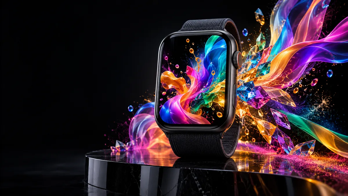
Why OLED Makes Colorful Wallpaper Look So Good
Apple Watch has used OLED panels since day one, and the technology keeps improving with each generation. On an OLED screen, pixels that display black are simply turned off — they emit zero light. That means a colorful wallpaper sitting against a near-pitch-black border or watch face frame gets no light bleed from neighboring pixels, so saturation reads at its absolute maximum.
Compare that to an LCD screen, where a backlight illuminates the whole panel constantly. Colors on LCD always have a slight milky wash because the backlight leaks through even “dark” areas. On OLED, a neon yellow sits next to true black and the contrast ratio is effectively infinite. The result: a colorful wallpaper for Apple Watch will look roughly 30–40% more vivid on the wrist than the same image on a standard laptop monitor.
High saturation is the other advantage. Apple Watch displays are tuned to the sRGB color space with display P3 coverage on newer models, meaning they can show a wider range of reds, greens, and blues than most monitors. Artists who design vibrant watch faces actually target these screens precisely because the final output rivals a printed poster for color intensity.
One practical note: very bright all-white wallpapers drain the battery faster on any OLED device because white pixels must be fully lit. But a vibrant rainbow on black — say, colored streaks against a dark canvas — costs almost nothing in battery terms while delivering maximum visual impact.
12 Colorful Wallpaper Styles Worth Using
Below are the twelve styles that consistently rank as favorites across watch face communities, Reddit threads, and design forums. Each one takes advantage of OLED contrast in a slightly different way.
1. Rainbow Spectrum Burst
A classic arc or full-circle rainbow radiating from the center. The clean ROYGBIV sequence reads instantly at a glance, and the black background between color bands makes each hue look lit from within. Great for pride events or anyone who wants an optimistic, uplifting vibe every time they check the time.
2. Paint Splash / Watercolor
Loose, wet-edged brushstrokes in two to five colors overlapping at the center of the face. Watercolor designs feel organic and handmade — a good counter to the otherwise very technical look of watch complications. Teal, coral, and gold is a popular three-color combo. For a tutorial on adapting these to watch proportions, the Apple Watch wallpaper ideas guide covers cropping and framing tips.
3. Tie-Dye Swirl
Concentric rings of saturated dye colors — magenta, electric blue, sunshine yellow — spinning outward from a center point. Tie-dye patterns are enjoying a sustained design revival and translate surprisingly well to the round or rectangular watch canvas. The swirling motion creates an optical illusion of depth.
4. Tropical Flowers
Close-up macro photography of hibiscus, bird of paradise, or heliconia blooms. The natural saturation in tropical petals is intense enough to photograph at near-display quality. Pair with a white or silver Sport Band to keep the overall look fresh and warm-weather ready.
5. Street Art / Graffiti
A cropped fragment of a mural or graffiti wall — bold outlined letters or abstract spray-can shapes in electric colors. These wallpapers skew younger in audience but work for anyone who wants their watch to feel expressive and urban. The rough texture of spray paint looks great at small screen sizes because detail fades and only the pure color blocks remain.
6. Stained Glass
Geometric shapes divided by dark outlines, each cell filled with translucent jewel tones: ruby, sapphire, emerald, amber. Stained glass designs are formal enough for office wear but still visually rich. The dark lead lines mimic OLED’s natural black and make the color cells glow. A strong candidate if you want vibrant but still polished.
7. Color Explosion on Black
Particles, ink drops, or powder bursts photographed mid-air against a pure black studio backdrop. This style shows what OLED can really do — individual droplets of magenta or cyan floating in what looks like actual darkness. A favorite genre on Unsplash’s color explosion collection, where high-resolution originals are available for free download.
8. Sunset Gradient (Vibrant Version)
Not the soft pastel sunset — this one pushes saturation all the way up. Hot orange at the horizon bleeding into electric fuchsia above, or a violet-to-gold sweep. If you already enjoy gradient designs, the Apple Watch gradient wallpaper guide covers the best sources and sizing for this exact category. The vibrant version is the same concept with all the softness dialed out.
9. Candy / Sweet Colors
Lollipops, macarons, or abstract shapes in candy-store hues: bubblegum pink, mint green, lemon yellow, sky blue. These sit in the medium-saturation zone — bright but not aggressive. A good entry point for anyone moving away from neutral or pastel faces without going full neon. They also pair well with lighter band colors. For the lighter end of this spectrum, the Apple Watch pastel wallpaper collection offers softer alternatives.
10. Neon Rainbow
Electric neon colors — the kind that glow as if backlit — arranged in stripes, waves, or grid patterns. Neon wallpapers are best on Series 6 and newer, where the Always-On Display at low brightness still shows readable colors. On older models they are equally striking but only visible when the wrist is raised. Pairs well with a black sport band to keep the palette controlled.
11. Color Block Geometric
Hard-edge shapes — squares, triangles, hexagons — each filled with a flat, solid color. Influenced by Bauhaus design, color block geometric patterns are clean, modern, and graphic. They print well as wallpapers because the crisp edges stay sharp even at Apple Watch’s high pixel density (typically 326 ppi on 41/45 mm models).
12. Kaleidoscope Pattern
A symmetrically reflected pattern radiating from a center point, usually derived from a photograph of flowers, crystals, or abstract shapes. Kaleidoscope designs fill the entire display with pattern and color, leaving no “dead” space. They are endlessly varied — a single source image can produce dozens of unique wallpapers depending on the reflection angle and zoom.
Colorful vs. Dark: When to Switch
Both color families have their place, and most Watch owners end up rotating between them depending on context. Here is a practical switching guide:
- Summer, outdoor activities, casual wear: Colorful wallpapers win. Natural light makes OLED look slightly dimmer outdoors, and a high-contrast colorful design fights back better than a dark minimal face.
- Winter, low light, evening: Dark or gradient faces are easier on the eye and draw less attention in dim restaurants or evening meetings.
- Formal business settings: Stained glass or color block geometric stay vibrant without looking loud. Avoid tie-dye or graffiti in board-meeting contexts unless that is part of your personal brand.
- Mood boost days: Research in environmental psychology consistently links viewing high-saturation colors to short-term alertness and positive affect. A colorful watch face during a slow Monday morning is a genuinely useful tool, not just a style choice.
- Fitness and sport: Bright, high-contrast designs help at a glance during a run or gym session when you do not want to tilt your wrist for a full second to read the time.
You can save multiple watch faces in the Watch app and swipe between them, so there is no reason to commit to a single style permanently. Most users maintain a “work” face and a “personal” face and rotate them like they rotate their band.
Color Psychology for Your Wrist
The color you stare at dozens of times a day matters more than the wall art you glance at once in the morning. Your watch face is constant, intimate, and checked at emotionally charged moments — before a meeting, during a workout, waiting for news. Choosing the right dominant hue has real behavioral effects:
- Red and orange: Associated with energy, urgency, and physical activation. Good for athletes or high-intensity workdays. Can increase perceived stress in already-anxious individuals, so use intentionally.
- Blue and teal: Psychologically calming and associated with focus and reliability. A neon blue on black is still visually bold but carries a cooler, more controlled energy than red. Popular in tech and finance contexts.
- Yellow and lime green: Optimism and alertness. Yellow is the most visually “loud” color at the same brightness level as other hues — it grabs attention faster than any other color, which is exactly what a watch face should do.
- Purple and violet: Creative, slightly mysterious. Works well in kaleidoscope or stained glass designs where it adds richness without loudness.
- Multi-color / rainbow: Inclusive, celebratory, playful. No single mood dominates; instead the overall effect is joy and variety.
A multi-color wallpaper with no single dominant hue is also the lowest-risk choice — you get the visual richness of full saturation without committing to one psychological signal.
Matching Bands to Vibrant Wallpapers
The band is the first thing people see before the screen lights up, and pairing it well with a colorful wallpaper elevates the whole aesthetic.
- Product RED Sport Band: The intense red pairs with nearly any warm-toned wallpaper — sunset gradient, paint splash with red accents, or a color explosion with prominent red particles. Avoid pairing with a heavy blue or green wallpaper where the red band will fight rather than complement.
- Rainbow Pride Sport Band: The small multicolor stripe design on an otherwise white band is the perfect understated companion to a rainbow or tie-dye wallpaper. The screen colors echo the band without competing.
- Vibrant Sport Loop (Ocean Blue, Starlight, Watermelon): These fabric loops have enough color saturation to hold their own next to a bold wallpaper. Ocean Blue against a neon geometric works particularly well.
- Black Sport Band: Actually the most versatile option for colorful wallpapers because the neutral band puts all visual focus on the screen. Color block geometric and neon rainbow both look cleanest against a black band.
- Milanese Loop or Link Bracelet: The metallic sheen contrasts interestingly with vibrant wallpapers and creates a “high-low” mix — formal hardware, playful display. Stained glass or watercolor are the best wallpaper matches for metal bands.
A general rule: if the wallpaper uses warm colors (red, orange, yellow), lean toward warm or neutral bands. If the wallpaper skews cool (blue, teal, violet), cool-tone or black bands read most cohesive.
Resolution & Sizing Table
To avoid cropping surprises, always start with an image at least as large as the target resolution. The Apple Watch display is not standard smartphone proportions — it is closer to square or mildly portrait, depending on the case size.
| Model | Case Size | Screen Resolution | Recommended Wallpaper Size |
|---|---|---|---|
| Series 10 | 42 mm | 394 × 484 px | 400 × 500 px |
| Series 10 | 46 mm | 416 × 496 px | 420 × 500 px |
| Series 9 / SE (2nd gen) | 41 mm | 352 × 430 px | 360 × 440 px |
| Series 9 / SE (2nd gen) | 45 mm | 396 × 484 px | 400 × 490 px |
| Ultra 2 | 49 mm | 410 × 502 px | 415 × 510 px |
| Series 8 / 7 | 41 mm | 352 × 430 px | 360 × 440 px |
| Series 8 / 7 | 45 mm | 396 × 484 px | 400 × 490 px |
For a full walkthrough on how to transfer the image from your phone to the watch face, the how to change Apple Watch wallpaper guide covers every step from Photo Faces to third-party apps.
Free Download Sources for Colorful Wallpapers
You do not need to pay for a colorful wallpaper for Apple Watch. Multiple high-quality free sources exist:
- Unsplash — Colorful Abstract: Thousands of free high-resolution images tagged “colorful,” “neon,” “rainbow,” and “vibrant.” All are licensed for personal use with no attribution required. Search “color explosion black background” for the OLED-optimized style.
- Pinterest — Apple Watch Colorful Wallpaper: Curated boards with pre-cropped Apple Watch wallpapers uploaded by the community. Many creators especially tag their images with the target series and size.
- Procreate and Canva templates: If you own an iPad, creating a custom 400 × 500 px canvas in Procreate or Canva and painting a quick two-minute abstract gives you a truly one-of-a-kind wallpaper. Canva’s free tier includes hundreds of colorful gradient templates.
- WatchWalls app: Browse curated collections organized by color family and style, pre-sized for every Apple Watch model. The app syncs wallpapers directly to the Watch app without any manual cropping.
When downloading from any source, check image dimensions before importing. An image narrower than 352 px wide will be upscaled and look soft. Anything 800 px wide or above can be cropped down without quality loss.
For additional style inspiration beyond colorful designs, the aesthetic Apple Watch wallpaper roundup covers minimalist, dark, and art-based categories that work well in rotation with vibrant faces.
Browse the full WatchWalls collection — filtered by color, style, and Apple Watch series. Every image is pre-cropped to the exact resolution your model needs, so there is no manual editing required.
Browse All Wallpaper StylesFrequently Asked Questions
Does a colorful wallpaper drain the Apple Watch battery faster?
Only if the image uses a lot of bright white. On OLED displays, white pixels draw the most power because all three sub-pixels (red, green, blue) must run at full brightness simultaneously. A colorful wallpaper on a black background uses partial pixel power for each color and virtually zero power for the dark areas, so it can actually be more efficient than a bright white face. A fully white image can draw up to three times the power of a fully black one, but a typical vibrant rainbow on black sits somewhere in the middle — roughly equivalent to a standard dark watch face.
What is the best colorful wallpaper style for everyday wear?
Stained glass and color block geometric are the most versatile for everyday use because they read as designed and intentional rather than casual or novelty. Both styles are visually rich but stay polished enough for professional settings. Tropical flowers are a close third — they are bold but naturalistic, which reads well in both outdoor and indoor contexts. Save tie-dye and graffiti styles for weekends or informal days if you work in a conservative environment.
Can I use a colorful wallpaper with the Always-On Display?
Yes. Apple Watch Series 8 and newer, plus Ultra models, support Always-On Display (AOD). In AOD mode the screen dims significantly — typically to around 1–2% of full brightness for dark pixels and proportionally higher for bright ones. A colorful wallpaper in AOD mode will appear as a muted, low-brightness version of the full design. High-contrast designs (bright colors on black) tend to remain more recognizable in AOD mode than low-contrast or pastel designs, because the bright color elements still emit enough light to form a visible shape.
How do I set a photo as my Apple Watch wallpaper?
Open the Watch app on your iPhone and tap “Face Gallery.” Scroll down to “Photos” and select it as a face type. You can then choose a specific photo from your library, an album, or let it rotate through a collection. Alternatively, open the Photos app, select the image, tap Share, and choose “Use as Apple Watch Face” if the option appears. For the cleanest result, crop the image to your watch’s exact resolution before importing — the sizing table above lists the dimensions for every current model.
Are kaleidoscope wallpapers distracting with watch complications?
They can be. Kaleidoscope patterns fill the entire display with fine repeating detail, which can make small text complications hard to read at a glance — especially date, weather, and activity ring data. The workaround is to use a kaleidoscope design as a pure photo face with no complications, letting the visual design stand alone. Alternatively, look for kaleidoscope wallpapers with a darker or more neutral center zone where complications can sit without competing with the surrounding pattern.