Best Texture Wallpapers for Apple Watch: Marble, Wood & Fabric
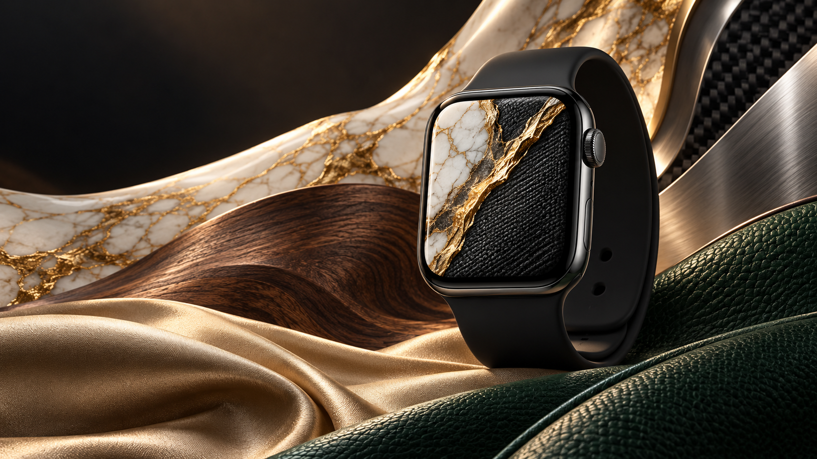
A good texture wallpaper transforms your Apple Watch from a fitness tracker into something that feels handcrafted. Unlike photo faces or bright color gradients, textures pull the eye in without competing with complications. The watch face stays functional — you can still read the time at a glance — while the background adds weight, warmth, or industrial edge depending on the material you choose.
This guide covers 12 specific texture styles, explains why they read well on a small display, walks through band-matching logic, and points you to free high-resolution image sources. Whether you want the calm luxury of white marble or the raw look of concrete, there is a texture here that fits.
Why Textures Work on a Small Screen
Most Apple Watch faces are between 40 mm and 49 mm diagonally. At that scale, a photographic horizontal becomes noise. A portrait loses facial features. But a texture — a close-up of wood grain, a slab of polished stone, the tight weave of linen — stays legible because it has no focal point that gets lost. The pattern repeats, and any crop of it reads the same way.
There are three practical reasons textures succeed where other images fail:
- No subject to misframe. You do not need to worry about centering a face or horizon. Crop anywhere and the image still works.
- Tactile suggestion. The visual weight of rough concrete or soft fabric gives the watch face a physical quality that flat color cannot. People notice it on your wrist and ask what face you are using.
- Complication contrast. Most texture wallpapers hover in the mid-tone range. White time digits and white complication icons sit cleanly over wood, stone, or fabric without needing a dark overlay or blur effect.
The one rule: avoid textures that are too busy in the center. Extremely fine herringbone weave or dense mosaic tile can make the time harder to read. When in doubt, choose a texture with some open area near the top third, where the hour and minute hands or digital time display will sit.
For related ideas on keeping the face clean and readable, see our guide to Apple Watch monochrome wallpapers — the same contrast principles apply.
12 Texture Styles Worth Using
1. White Marble with Gold Veins
Calacatta marble — white base, bold gold and grey veining — is the most requested texture style on the site. It photographs as luxury without looking overdone. Use a crop where a single thick vein runs diagonally from bottom-left to top-right. The asymmetry keeps it from looking too decorative.
2. Dark Wood Grain
Walnut or dark oak with pronounced grain lines reads beautifully in portrait orientation. The natural variation in wood — lighter streaks, occasional knots — means no two crops look identical. This is the texture that ages best: a year after you set it, it still feels intentional rather than trendy.
3. Italian Leather
Full-grain vegetable-tanned leather in cognac or saddle brown has a pore pattern that photographs at macro range into a rich, matte surface. On a watch face, it suggests a classic watch strap even when you are wearing rubber or nylon. Pair with the Modular or Infograph face for the cleanest look.
4. Crocodile or Embossed Leather
The geometric scale pattern of crocodile leather — or its embossed synthetic equivalent — gives the face a strong graphic structure. Dark green, navy, or chocolate brown are the colors that hold up. Avoid beige crocodile; it reads as plastic at small sizes.
5. Concrete and Industrial
Raw concrete with visible aggregate and trowel marks is a strong choice for Series 7 and later models with the larger flat-edge case. The grey tone shifts depending on your ambient light, which creates a subtle daylight-to-evening transition effect without any dynamic setting. Pair with black or midnight aluminum case colors.
6. Brushed Metal and Titanium
A macro photograph of brushed stainless steel or titanium shows directional micro-scratches that catch light differently at every angle. This texture is particularly effective on Ultra 2, where the titanium case already has that brushed finish — the wallpaper and the physical material echo each other.
7. Woven Fabric and Linen
Natural linen, canvas, or heavy cotton twill photographed at close range shows thread count and color variation that gives the face an organic softness. Off-white linen with warm grey overtones is the most versatile. It works with almost any complication color and every band type.
8. Stone and Slate
Dark slate with its fine horizontal cleavage lines is one of the most underused texture wallpaper options. It works especially well with the Meridian or GMT face, where the dark background and white text feel like chalk on a blackboard — clean, confident, and easy to read outdoors.
9. Cork
Cork has a warm amber-to-brown color and a cellular dot pattern that photographs into an almost abstract surface. It is lighter in visual weight than wood and sits between fabric and stone on the softness scale. A good choice if dark wood feels too heavy but linen feels too plain.
10. Carbon Fiber
The diagonal weave of carbon fiber — alternating matte and gloss bands — creates a pattern that changes appearance as the viewing angle shifts. On a watch face, the effect is most visible with matte-finish screen protectors removed. Use a tight crop so the individual weave cells are clearly visible rather than blurring into uniform grey.
11. Silk and Satin
Draped silk or charmeuse satin with soft folds and a subtle sheen photographs into a texture wallpaper that suggests movement. Ivory, champagne, and dusty rose are the best colors. Use for dress occasions or when you want the watch face to feel formal without adding complications.
12. Terrazzo
Terrazzo — chips of marble, quartz, and glass set in cement — is having a long-running design revival. The multi-colored fleck pattern is bold but not busy, because each chip is distinct. Use a crop with a neutral grey or cream base so the colored flecks provide interest without drowning the time display.
For more ideas on premium face aesthetics, see Apple Watch luxury wallpapers — many of those picks overlap with the marble and silk categories above.
Color Palettes That Actually Look Good
Texture wallpapers fall into four color families, each with a different emotional register and a different set of complications that read well against them.
Neutral Earth Tones
Linen, cork, light concrete, and warm stone share a palette of oatmeal, wheat, terracotta, and grey-taupe. These are the most forgiving colors for complication readability because they sit in the mid-value range — neither too dark for white text nor too light for grey icons. The Activity rings show up cleanly in any color over this palette.
Warm Wood and Gold
Dark walnut, rich mahogany, and marble with gold veining create a palette of amber, sienna, and warm gold. White complications and yellow-gold watch faces pair naturally. Avoid cool-toned blue or green complications — they fight with the warmth of the base.
Cool Stone and Silver
Slate, light grey concrete, brushed titanium, and white marble with grey veining sit in a cool-neutral palette of silver, charcoal, and pale grey. Blue, white, and light green complications look excellent. The Apple Watch Ultra 2 in natural titanium was practically designed for this palette.
Dark Industrial
Carbon fiber, black leather, dark concrete, and dark wood grain share near-black or very dark brown tones. This palette belongs with the Apple Watch black wallpaper category. Yellow, orange, or white complications are the only ones that hold against a very dark background. Avoid dark blue or green — they disappear.
Matching Your Texture to Your Band
Band and wallpaper matching is the fastest way to make the watch feel like a considered accessory rather than a tech product. The principle is simple: match material to material, or contrast intentionally.
| Band Type | Best Texture Wallpaper Match | Why It Works |
|---|---|---|
| Leather (smooth) | Italian leather, dark wood | Material harmony — both natural, both warm |
| Braided Solo Loop | Woven fabric, linen | Thread-based materials echo each other |
| Milanese Loop | Brushed metal, titanium | Metallic texture on wrist matches face |
| Sport Band (rubber) | Concrete, carbon fiber | Functional/industrial materials match the band’s utility feel |
| Sport Loop (fabric) | Silk, terrazzo, cork | Soft materials stay cohesive; terrazzo adds color contrast |
| Link Bracelet (stainless) | White marble, brushed metal | Premium case material deserves a premium-feeling face |
The contrast approach also works. A carbon fiber wallpaper with a Sand Sport Loop creates a sport-meets-industrial tension that looks intentional. A white marble face with a black sport band does the same in a more classic way. The rule is that accidental mismatches — generic photo face with premium band, or a cartoon wallpaper with a Link Bracelet — are what looks unconsidered.
If you are still building out your face collection, the Apple Watch wallpaper ideas guide has a broader starting list organized by use case rather than material.
How to Photograph Textures Yourself
Custom textures — photographed from objects you own — are almost always better than stock images. They are unique, you know the exact color, and they are already optimized for how your specific screen renders color.
Equipment
You need a smartphone with a macro or close-focus capability. iPhone 13 Pro and later have a dedicated macro lens. Any phone can manage with a clip-on macro lens (under $15). A mirrorless camera with a 50 mm or 100 mm macro lens gives the best results but is not required.
Lighting
Natural window light from the side — not front-lit, not direct sun — is the gold standard for textures. It rakes across the surface and catches micro-relief: the grain of wood, the pores of leather, the threads of fabric. Direct overhead light flattens everything. If you are shooting indoors at night, use a single LED panel or desk lamp positioned at a 30-45 degree angle to the surface, not directly above.
Shooting Tips
- Fill the frame completely. You do not want any object edges visible — just pure texture.
- Shoot more than you need. Take 10-20 frames at slightly different distances and crops. You will find one that reads perfectly at 396×484 px.
- Avoid autofocus hunting on uniform surfaces like concrete or linen. Lock focus manually or tap to focus on a detail with visible structure.
- For shiny surfaces like brushed metal or silk, a small piece of matte black foam board held off-frame eliminates unwanted reflections.
Editing
Minimal editing works best. Increase clarity or texture (Lightroom) by +10 to +20 to make fine detail visible at small sizes. Adjust white balance to correct any color cast from artificial lighting. Do not over-sharpen — texture images already have natural edge contrast and heavy sharpening creates haloing.
Free Sources and Resolution Guide
If you are not photographing your own textures, these sources offer high-quality images with licenses that allow personal use:
- Unsplash Textures — The largest free collection. Search by material name: “marble”, “wood grain”, “linen”, “concrete”. All images are free to use without attribution for personal use under the Unsplash License.
- Pexels Texture Collection — Strong for fabric, leather, and stone categories. Filter by orientation (portrait) to find images that are already correctly framed for a vertical crop. Free under the Pexels License.
- Subtle Patterns — Tileable texture patterns designed for digital use. Particularly useful for fabric and paper textures. Many are available in dark and light variants.
Resolution Reference Table
| Model | Case Size | Screen Resolution | Recommended Image Size |
|---|---|---|---|
| Apple Watch Ultra 2 | 49 mm | 410×502 px | 820×1004 px (2×) |
| Series 10 / Series 9 (Large) | 46 mm / 45 mm | 396×484 px | 792×968 px (2×) |
| Series 10 / Series 9 (Small) | 42 mm / 41 mm | 352×430 px | 704×860 px (2×) |
| Series 4–6 (Large) | 44 mm | 368×448 px | 736×896 px (2×) |
| Series 4–6 (Small) | 40 mm | 324×394 px | 648×788 px (2×) |
Always export at 2× (double the screen resolution) to ensure sharpness on Retina displays. Most source images from Unsplash or Pexels are large enough — download the original rather than the web-optimized version.
For step-by-step instructions on setting your image as a watch face, see how to change Apple Watch wallpaper.
Browse 200+ curated texture wallpapers for Apple Watch — marble, wood, leather, fabric, and more — all pre-cropped to the correct resolution for your model. Free to download, no account required.
Browse Texture WallpapersFrequently Asked Questions
What is the best texture wallpaper for Apple Watch readability?
Mid-tone textures — warm stone, medium wood grain, natural linen — give the best readability because white complications sit clearly above them without disappearing. Very dark textures (black carbon fiber, dark concrete) require white or yellow complications. Very light textures (white marble, ivory silk) need dark grey or black complications. Avoid textures with strong local contrast near the center of the face where the time display appears.
Can I use any image as an Apple Watch wallpaper?
Yes, through the Photos face. Open the Apple Watch app on iPhone, go to Face Gallery, select Photos, and choose your image from your camera roll. Apple Watch will let you pan and zoom the crop before applying. The image should be in portrait orientation and at least 396×484 px for the 45 mm model. JPEG and HEIC formats both work; PNG also works but takes longer to transfer.
Do texture wallpapers drain the Apple Watch battery faster?
No more than any other always-on display setting. The display hardware draws the same power regardless of what image it is showing. Dark textures — black leather, dark carbon fiber, dark concrete — will actually use marginally less power on OLED models (Series 4 and later) because OLED pixels are physically off when displaying true black. The energy difference is negligible in practice but the direction is: darker textures are slightly better for battery than lighter ones.
What resolution should I use for Apple Watch texture wallpapers?
Export at double the screen resolution for your model. For Series 9 and Series 10 in 45 mm, that is 792×968 px. For Ultra 2, use 820×1004 px. Images downloaded from Unsplash or Pexels are typically 3000–6000 px on the long edge, so you have plenty of resolution to crop tightly without losing sharpness. Avoid upscaling small images — texture detail that looks fine at 800 px will look blurry when upscaled to fill the watch screen.
Which Apple Watch face works best with texture wallpapers?
The Photos face is the primary option because it shows the full texture across the entire display. Modular Compact and Infograph Modular also work if you need many complications — both faces use a dark background mode that can be replaced with a photo. For purely aesthetic use, Photos face with one or two complications (time and date only) is the cleanest option and lets the texture show with minimal interruption. Avoid California, Chronograph, or analog faces if you want maximum texture visibility, as the watch hands cover a large portion of the face.