 WatchWalls AI
Best Apple Watch Wallpapers for Seniors: Easy-to-See Designs
Why Wallpaper Choice Matters for Older Users
Choosing the right wallpaper for seniors makes a real difference on Apple Watch. Most people pick an Apple Watch wallpaper because they like how it looks. For seniors, however, the choice carries real practical weight. A poorly chosen background can make it genuinely difficult to tell the time, dismiss an alarm, or read a health notification — the very things a smartwatch is supposed to make easier.
Here are three reasons wallpaper choice becomes more important with age:
Contrast and Readability
Apple Watch complications — the small data widgets that show steps, heart rate, temperature, and time — sit directly on top of the watch face background. When the background color is too close in brightness to the complication color, the text becomes hard to distinguish. This is called poor contrast ratio. The Apple Accessibility team recommends high-contrast interfaces for users with low vision or age-related changes in eyesight, and the same principle applies to your watch face.
Eye Comfort
Older eyes are often more sensitive to bright, saturated blues or whites that flash in dim environments. A dark background emits less total light from the OLED display while still keeping complications clearly visible. This is why dark Apple Watch wallpapers are consistently the most popular choice among users over 60.
Glanceable Information
The whole point of a smartwatch is that you read it in under two seconds without reaching for glasses. A busy, detailed photo behind your complications destroys that glanceability. Clean, simple backgrounds preserve it.
10 Best Wallpaper Styles for Seniors
Below are the ten wallpaper styles that consistently work best as wallpaper for seniors on Apple Watch, ordered from highest practical value to more personal preference.
1. Solid Black Background
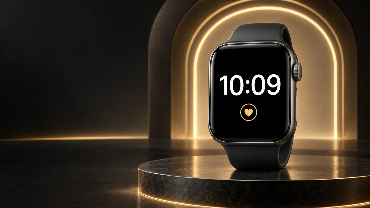
Nothing beats pure black on an OLED screen. The pixels are literally off, saving battery and producing perfect contrast with white, yellow, or green text complications. The Apple Watch black wallpaper is the single easiest upgrade you can make for readability. Use it with the Modular or Infograph watch face for maximum data visibility.
2. Deep Navy Blue
Navy (#0A0F2E or similar) feels warmer than black and still provides near-perfect contrast. It pairs particularly well with yellow or gold complication colors, creating a classic, easy-to-read look reminiscent of a traditional clock face.
3. Large Single Flower Close-Up
A tight macro shot of one flower — a sunflower, rose, or lily — against a naturally dark background gives the watch a personal, cheerful feel without sacrificing readability. The key is choosing an image where the center of the watch face (where the time sits) falls over a darker petal or stem area, not over a bright highlight.
4. Family Photo — Grandchildren
One of the most emotionally meaningful choices. Apple Watch allows you to set a photo face that cycles through a photo library or shows a single portrait. For seniors, a clear, well-lit photo of grandchildren works beautifully. Choose a portrait with a slightly darker background (taken outdoors in shade, for example) so the complications remain readable. The Photos watch face lets you tap the screen to see the full image without complications, which is a nice bonus.
5. Simple Gradient — Dark to Slightly Lighter
A gradient that moves from dark charcoal at the top to dark slate at the bottom is nearly as effective as solid black, but it adds subtle visual depth. Several built-in Apple Watch color faces use this approach. It pairs well with the minimalist watch face styles that show only the time and one or two complications.
6. Calm Nature Scene
A wide-angle mountain valley at dusk, a forest path at golden hour, or a quiet lake at sunrise — scenes like these tend to have large areas of uniform dark color (sky, water, shadow) that sit behind the watch face complications without competing. Nature scenes also have a documented calming effect, which is a genuine consideration for users who check their heart rate or stress reminders on-watch.
7. High-Contrast Geometric
A simple geometric design — concentric circles on black, a single bold line, a dark hexagon pattern — reads immediately as a background rather than content. Your brain doesn’t try to interpret it as a meaningful image, so the complications pop forward visually. This style works especially well for users who want something more modern than a solid color.
8. Bold Single Color (Dark Red, Forest Green, Deep Purple)
A deeply saturated single color that’s still dark enough to provide contrast is a good middle ground between personality and readability. Dark forest green (#0D2B1A), burgundy (#2C0A0A), and deep plum (#1A0A2C) all test well. Avoid pale versions of these colors — the dark variants only.
9. Sunrise or Sunset
A warm amber-to-deep-orange sunset image feels welcoming on the wrist and the warm tones are easier on eyes that are sensitive to cool blue light. Many seniors find sunrise and sunset photos emotionally positive as well. Use a version where the sun is near the horizon so the foreground is naturally darker — place that darker area where your time complication sits.
10. Pet Photo
Similar to the family photo choice, a well-framed photo of a beloved pet on a dark or blurred background works well on a small screen. Portrait mode photos (soft background blur) are ideal because they naturally isolate the subject and leave the edges of the frame darker — exactly where Apple Watch places its complications.
Best Color Contrast Rules
Color contrast is not just about aesthetics. It determines whether you can read your watch in bright sunlight, in a dim bedroom, or with glasses off. Follow these four rules when selecting any wallpaper for seniors:
Rule 1: Dark Background, Light Text
This is non-negotiable. White or yellow complication text on a dark background gives a contrast ratio well above 4.5:1 — the minimum recommended by accessibility guidelines. Light background with dark text can work on paper but fails in variable outdoor lighting conditions.
Rule 2: Avoid Pastels
Pastel backgrounds (light pink, baby blue, mint green) sit in exactly the same brightness range as white complication text. The result is a watch face that looks washed out and where the time is difficult to read at a glance. If you love those colors, use the dark saturated version instead.
Rule 3: High Saturation Increases Perceived Contrast
A highly saturated deep blue background and white text look sharper than a mid-gray background and white text, even if the raw brightness difference is similar. Saturation gives the eye a second cue (color difference, not just brightness difference) to separate text from background.
Rule 4: Avoid Busy Backgrounds Under Complications
If your chosen image has a complex area of texture, grass, or foliage sitting directly behind the time display, the eye has to work hard to separate the digits from the background noise. Either choose an image with a plain area in the center, or use a watch face with a background blur option.
How to Set Wallpapers on Apple Watch
This guide assumes you have never changed your Apple Watch face before. Every step is explained in plain language — no prior experience needed. For a full visual walkthrough, see how to change Apple Watch wallpaper.
Method 1: Change to a Built-In Solid Color Face (Easiest)
- On your Apple Watch, press and hold the watch face (the main screen showing the time) for about two seconds until the display zooms out and shows your current face in the center with left and right arrows.
- Swipe left or right to browse your saved watch faces.
- Swipe all the way to the right until you see a large + button labeled “New.” Tap it.
- Scroll through the list of available faces. Look for Color, Meridian, or Modular — these support solid color backgrounds.
- Tap the face you want. Then tap Edit.
- Swipe left to reach the Color section. Turn the Digital Crown to scroll through colors and select a dark navy, black, or deep color.
- Press the Digital Crown to save. Tap the face to set it as your current face.
Method 2: Set a Photo as Your Watch Face
- On your iPhone, open the Watch app (it has a black icon with the watch silhouette).
- Tap Face Gallery at the bottom center of the screen.
- Scroll down and tap Photos.
- Tap Add in the top right corner. A new Photos face is added to My Faces.
- Tap My Faces at the bottom left of the screen.
- Find the Photos face you just added and tap Edit.
- Tap Content and then choose either Dynamic (cycles through your photos) or Photo Album (pick a specific album) or tap a specific photo from your library.
- Adjust any complications shown, then tap Done in the top right.
- The face will sync to your watch within a few seconds if both devices are nearby.
Method 3: Download a Free Image and Use It
- On your iPhone, open Safari and go to Unsplash.com. Search for a dark background, nature photo, or flower image.
- Tap the download button on the image you like. It will save to your Photos app.
- Follow Method 2 above, selecting this new image in step 7.
Tip: If the image looks blurry or cropped oddly on the watch, go back to step 6 in Method 2 and use the pinch gesture to zoom and position the photo before saving.
Text Size & Complications Tips
Choosing the right wallpaper is only half the solution. The watch face itself — which controls text size, number of complications, and layout — matters just as much. Here is how to get the most readable setup:
Choose Watch Faces With Large Time Digits
The Modular face, Simple face, Utility face, and Numerals Mono face all display the time in significantly larger digits than faces like Infograph. If reading the time quickly is a priority, start with one of these. The minimalist watch faces guide covers all the low-clutter options available.
Limit Complications to What You Actually Use
Every additional complication on your watch face competes visually with the time. For seniors, two to three complications maximum is ideal — typically: time, date, and one health metric (heart rate or activity rings). More than that and the face becomes difficult to scan quickly.
Set Complication Colors to Maximum Contrast
When editing a watch face, you can often choose the color of the complication text. White or yellow on a dark background provides the highest contrast. Avoid gray complication text on any background.
Use the Large Text Watch Face
Apple introduced the Modular Compact and X-Large watch faces especially for users who want maximum font size. The X-Large face shows nothing but the time in the biggest possible digits — no complications, no extra data. It is the most readable option available on any Apple Watch model.
Accessibility Features That Help
Apple Watch has several built-in accessibility features that work alongside your wallpaper choice to improve visibility. According to the Apple Vision Accessibility page, the following settings are available in watchOS:
Bold Text
To enable Bold Text on Apple Watch: open the Settings app on your watch, tap Accessibility, then Display & Text Size, then toggle Bold Text on. This makes all on-screen text thicker and easier to read, particularly on complex watch faces.
Larger Text
In the same Display & Text Size menu, tap Larger Text and drag the slider to the right to increase text size across the system, including notification text and app labels.
Reduce Motion
Animated watch faces and the parallax effects on some backgrounds can be disorienting for users sensitive to motion. Go to Settings > Accessibility > Motion and enable Reduce Motion. Animated faces will switch to static versions, and background parallax effects will be disabled.
Zoom
Apple Watch supports a zoom feature that magnifies the screen when you double-tap with two fingers. Enable it at Settings > Accessibility > Zoom. This is useful when reading small notification text, even if your regular watch face is already well-optimized.
Grayscale Mode
For users with certain color vision conditions, enabling grayscale mode (also in Display & Text Size) ensures that all information on the screen is conveyed through contrast and shape, not color alone. It pairs well with a black background and white text for maximum clarity.
The site Tech Enhanced Life has additional guides on setting up Apple Watch especially for older adults, including reviews of accessibility features by seniors themselves.
For overnight use and sleep health, pair these settings with an appropriate face — the Apple Watch sleep face guide covers the best low-brightness options.
Resolution Table & Free Sources
Apple Watch screens vary by model. When saving or downloading images to use as a watch face background, these are the pixel dimensions to target:
| Apple Watch Model | Screen Size | Resolution (pixels) |
|---|---|---|
| Series 9 / 10 (45mm) | 45mm | 484 × 484 |
| Series 9 / 10 (41mm) | 41mm | 430 × 430 |
| Ultra 2 | 49mm | 502 × 502 |
| SE (2nd gen, 44mm) | 44mm | 368 × 448 |
| SE (2nd gen, 40mm) | 40mm | 324 × 394 |
| Series 6 / 7 / 8 (45mm) | 45mm | 484 × 484 |
In practice, Apple Watch will scale and crop any photo you choose through the Watch app, so you do not need to resize images manually before importing. However, starting with a higher-resolution source image gives a sharper result after cropping.
Free Sources for High-Quality Watch Wallpapers
- Unsplash — free, high-resolution photos under an open license. Search “dark background,” “black flower,” or “dark nature” for senior-friendly options.
- Your own iPhone Photos app — family photos and personal shots are always the most meaningful choice and are already optimized for Apple’s ecosystem.
- Apple’s built-in watch faces — several come with dark built-in backgrounds including Solar, Gradient, and Color faces. No download needed.
Browse our full collection of black and dark Apple Watch wallpapers — all sized correctly and tested for maximum contrast with white complications. Free to download, no sign-up required.
Frequently Asked Questions
What is the easiest Apple Watch wallpaper for seniors to read?
A solid black background with the X-Large or Modular watch face is the easiest setup for most seniors. The black background creates maximum contrast with white complication text, and these face styles use the largest available time digits. You can set this in under one minute directly on the watch without needing your iPhone.
Can I use a photo of my grandchildren as an Apple Watch wallpaper?
Yes. The Photos watch face lets you set any image from your iPhone photo library as the background. For best results, choose a portrait-mode photo with a soft blurred background so the complications remain readable. Open the Watch app on your iPhone, tap Face Gallery, then Photos, then Add — and select your photo from there.
Does a dark wallpaper save battery on Apple Watch?
Yes, on Apple Watch models with OLED displays (Series 4 and newer), dark or black pixels are powered off entirely rather than lit, which measurably reduces battery consumption. A pure black background uses less energy than any other color. This is an additional practical benefit of the dark wallpaper recommendation for seniors.
How do I make the text on my Apple Watch bigger?
On your Apple Watch, open Settings, then tap Accessibility, then Display & Text Size, and toggle Bold Text on. To make text even larger, tap Larger Text in the same menu and drag the slider to the right. You can also switch to the X-Large watch face, which shows the time in the maximum available font size with no other information competing for space.
Are there wallpapers on Apple Watch made especially for seniors?
Apple does not label any watch face as especially for seniors, but several built-in faces are clearly designed with readability in mind: X-Large (huge time digits, nothing else), Modular (customizable, large text options), and Color (solid colored background, minimal design). These work better as wallpaper for seniors than decorative faces like Kaleidoscope or Mickey Mouse, which prioritize aesthetics over legibility.